Shake Shack is back before the Darien Zoning Board of Appeals with a new request to get approval for signs larger than the town zoning regulations currently allow.
The reapplication has new arguments to justify signage slightly smaller than what the ZBA rejected in the original application for a zoning variance.
The new application has a statement from a signage expert who writes that at least some of the signs need to be large enough for passing drivers to read from a safe distance before the driver decides to turn into the parking lot of the restaurant.
What They’re Requesting

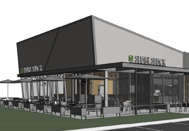
A view of the building and the side (facing west) where one of the large signs would be located, with the burger logo now next to the sign.
Other changes in the application are a reduction in the height of the front sign (Sign #1) by 2 inches (from 24 inches high to 22), moving the burger logo from spots near the top of the building walls down to where the signs are and removing a band of words from the building.
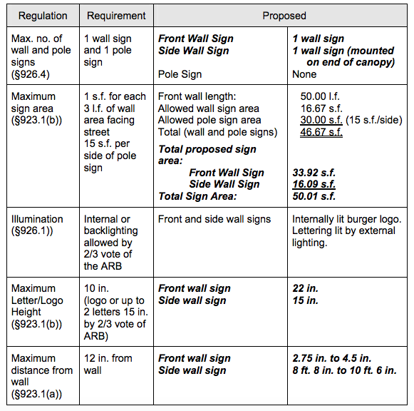
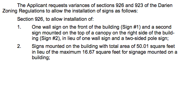
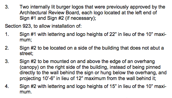
Here’s what Shake Shack is asking the town to allow as variances from zoning regulations:
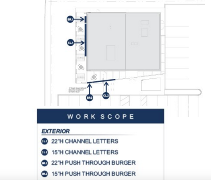
- A sign on the southwest side of the building would remain at 15 inches high and
- Putting the sign on the edge of the canopy on an angle from the side wall (from 8 feet, 8 inches to 10 feet, 6 inches away from the wall) instead of within 12 inches of the wall.
- An increase in the square footage of the total amount of signage from 46.67 square feet to 50.01 square feet;
- Instead of having signs on a pole, which is allowed, instead having a sign on the side of the building.
Here are some excerpts from the application showing what the Zoning Board of Appeals is being asked to do:
A Safety Argument Instead of an Emphasis on Branding Needs
After ZBA members indicated they weren’t going to approve the previous Shake Shack application mostly because they thought the signs were too large, representatives from the company said they were not interested in making changes, and the signs were an essential element of their branding.
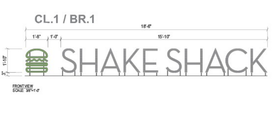
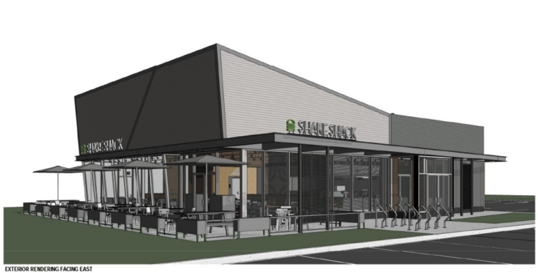
The sign proposed for the front of the building, 1 foot, 10 inches high.
The ZBA then voted to reject the application. The ZBA recently approved a large “Jaguar” sign across the street, but zoning officials said the applicant in that case had made a strong case that the sign was an essential element of the car company’s branding.
The present reapplication again mentions branding, but it doesn’t emphasize it as a vital reason for the zoning variance. Instead, it concentrates on safety, saying drivers not familiar with Darien who are driving on the Post Road (at a point about 1,000 feet from the southbound-traffic Exit 11 on Interstate 95 and its entrance) wouldn’t have enough time to react and make a safe turn into the restaurant parking lot.
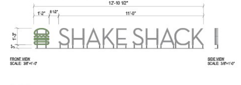
The sign proposed for the side of the building, on the edge of the canopy.
The application includes a statement (an “Expert Opinion Letter”) from Richard Crawford, a consultant with Mercer Sign Consultants of Doylestown, Penn. and a former president of the United States Sign Council (currently he’s a legislative consultant for that organization). He’s also a project manager with the Bartush Signs Inc. of Orwigsburg, Penn.
Crawford recommended sign letters 27.44 inches high. He wrote:
“In the most recent Shake Shack sign design file by Jones Sign Company, the letter size for Sign #1 has been revised to 22-inch tall letters. In my opinion, this size represents the minimum relief necessary to achieve a visible and legible sign for drivers on the Northwest (front) elevation. Any size below 22-inch tall letters will not afford drivers enough time and distance to detect the sign, read the sign, and execute a driving maneuver including appropriate indication of turn into the Shake Shack entrance.”
Popular Restaurant
The Shake Shack proposal has been extremely popular in and around Darien, but the size of the signs has been discussed at least since the proposal was first put before the Planning & Zoning Commission on Election Day last November. At that time, P&Z Commission members said they expected to reconsider the town’s signage regulations, but that process isn’t expected to start until later this year.
In the meantime, Shake Shack and a company associated with Baywater Properties, the owner of the three-quarter-acre property, have sought to get approval so that the restaurant could be built and opened by early fall 2016.
See past coverage of the Shake Shack proposal from Darienite.com:
- For Shake Shack in Darien: Wheels Are Turning, Proposal May Be Revived (April 6)
- Is There Still Hope for Shake Shack Coming to Darien? Maybe. (March 25)
- Both Shake Shack Applicants, Zoning Board Say the Other Side Wasn’t Cooperative (March 24)
David Genovese, principal of Baywater Properties, said he was shocked when the ZBA refused to budge on the size of the signage and some of the other sign variance requests. ZBA officials said they felt bound by the regulations enacted by the P&Z in the past.
Various officials have said in the past that hardships need to be cited that show the variances are needed, otherwise other applicants will ask for the same thing and the zoning regulations would become a dead letter.
Sidebar: Crawford’s Recommendations on Signage
Here’s a longer excerpt from Crawford’s letter on signage and safety:
A. Based on the needs of the driver and traffic safety research related to on-premise signs, I recommend a letter size of 27.44 inches tall for both Sign #1 and Sign #2. This letter size will result in a sign that is both visible and legible for drivers on Boston Post Road traveling in either direction, and will insure that drivers have an appropriate amount of time to see the sign (detect the sign), read and comprehend the message, make a driving decision if needed, and execute a safe driving maneuver. All of these functions must be performed on a “pre-sign” basis. That is to say, the driver must accomplish all of these tasks in order to safely turn into the Shake Shack entrance before they pass the sign.
B. In regard to Sign #1, this is the primary sign identification for drivers traveling in both directions on Boston Post Road. Strict application of the Darien code allowance to Sign #1 will have a definite impact on a driver’s ability to see and read the sign. In my opinion, the sign would not have adequate sign visibility or legibility for this particular site, would not afford adequate time for drivers to react to the sign and execute a driving maneuver, and would therefore result in an unsafe situation. Arbitrarily limiting letter height compromises sign visibility and legibility, as shown by the research.
C. In the most recent Shake Shack sign design file by Jones Sign Company, the letter size for Sign #1 has been revised to 22” tall letters. In my opinion, this size represents the minimum relief necessary to achieve a visible and legible sign for drivers on the Northwest (front) elevation. Any size below 22” tall letters will not afford drivers enough time and distance to detect the sign, read the sign, and execute a driving maneuver including appropriate indication of turn into the Shake Shack entrance.
D. Simple zoning relief in this case will allow a sign that will help prevent and/or minimize a whole range of inappropriate driving behaviors. It is not simply a matter of avoiding traffic accidents, thought that is a critical concern. Zoning relief will address other driving behaviors that should be minimized: sudden stopping due to short comprehension distances, slowing down due to driver uncertainty about the location, drivers missing the entrance and having to pass-by and then being forced to make a u-turn down the roadway or turn around in an adjacent parking lot in order to re-enter the roadway.
E. To my knowledge, there are no existing design standards or traffic safety standards that would support a building-mounted letter size at 10 inches for this location, given the road and traffic conditions, and the distance of the signs from the road.
[…]
G. Given the demographics of the area, the traffic volume on Boston Post Road and the proximity of the site to a major highway, it cannot be assumed that all visitors to the Darien Shake Shack will be local or from the neighborhood; many will be from the area of course, but a percentage will not be. These are the drivers that have critical sign visibility and legibility needs.
